A non-profit tool for people from all over the world who sympathize with Ukraine because of the atrocities committed on its territory by the Russian government and the army, and who want to financially support Ukraine's struggle for its freedom and independence.
1 Create an intuitive interface for people of different ages and technical literacy, who are united by compassion for Ukraine.
2 Develop a secure and trustworthy tool to easily send donations from anywhere in the world.
3 Provide the ability to select a donation goal of the user's preference and create your own goal.
I conducted an offline survey of people who were interested in helping Ukraine. Among them were citizens of EU, Asia and Middle East, aged from 25 to 85, with different levels of education, technology and political awareness. Many of the participants would like to make donations for a specific purpose, but did not find foundations that would do this. Some respondents were unable to donate because they could not pay with their card or did not have access to the required payment methods. Some participants were afraid to be scammed.

Name: Haitao
Age: 37
Occupation: DevOps Engineer
Haitao was born and has been living in China all his life. He works for a large IT company. Haitao loves his homeland, but dreams of the advent of democracy and the triumph of human rights in his country. He zealously follows the news of the world and is used to questioning official sources. Haitao makes good money and enjoys it if he can spend it on a good cause. He is very concerned about the war in Ukraine, and is rooting for Ukraine's victory.
Name: Kaarina
Age: 72
Occupation: Retired
Kaarina has worked at a dairy factory for 50 years. Now she is a pensioner and devotes most of her time to her grandchildren. She also volunteers at the local church and helps lonely people. Since childhood, she remembers her parents' stories of the Russian-Finnish war and sees with fear that the similar tragedy is happening again with Ukraine. She has some savings and would like to help Ukrainian children affected by the war, as well as donate to other humanitarian causes.
An audit of a few competitor's products provided direction on gaps and opportunities to address with the designed app.
Many competitor's products don't look trustworthy, they don't provide enough information about the security of transactions, foundations they cooperate with, or donation usage reports.
Some competitor's apps are in Ukrainian and don't even have the English version, not to mention other languages. Many apps do not offer a unified payment method accessible from anywhere in the world, but offer options that may not be available to the user.
The majority of apps do not aggregate a sufficient variety of issues for donation, and are only limited to a few options, which might not be suitable for the user. None of the competitors provide an option of an automatic recurring donation.
Some applications use too bureaucratic language that does not encourage the user to empathize and donate.
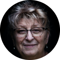
To prepare for usability testing, I created a low-fidelity prototype that connected the user flow of choosing an issue to donate to and making a payment.
The low-fidelity prototype connected the primary user flow of choosing a donation goal, entering card details and submitting the payment, so that the prototype could be used in a usability study with users.
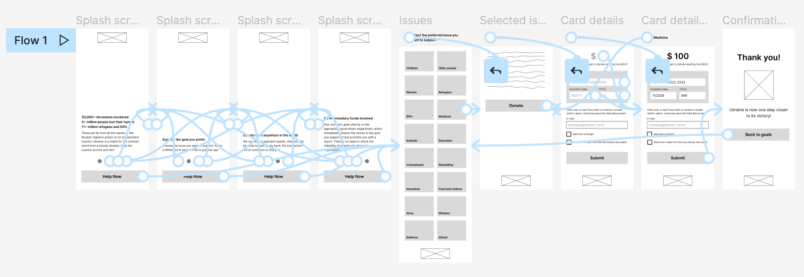
View the low-fidelity prototype ➜After creating the lo-fi prototype I conducted the usability study to find out if users can complete the core tasks within the app. Five participants went through a moderated study. I grouped my observations and users' comments into themes and created an affinity diagram. The research revealed several themes of common user problems.
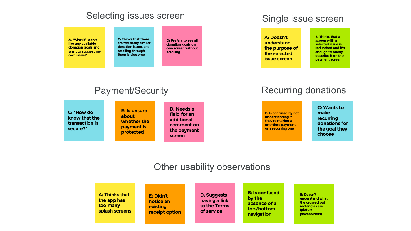
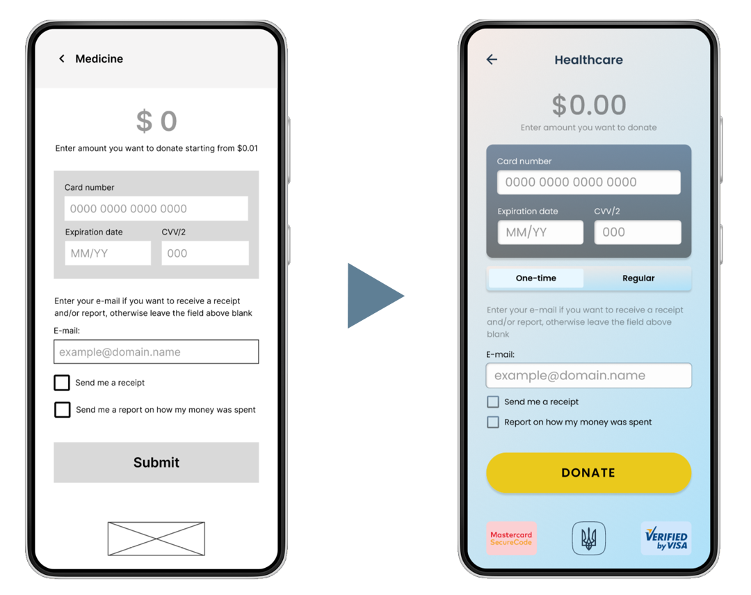
1 People need a more concise and clear list of goals; they need an option to suggest their own donation goal.
2 People should be able to select whether they are making a one-time or a recurring donation.
3 People must have payment security guarantees.
4 People should be redirected to the Payment screen right after choosing a donation issue without a redundant Single issue screen.
Considering key UX study findings and brand color palette, I designed mockups and created a high-fidelity prototype of the recipe organizer app.
View the high-fidelity prototype ➜
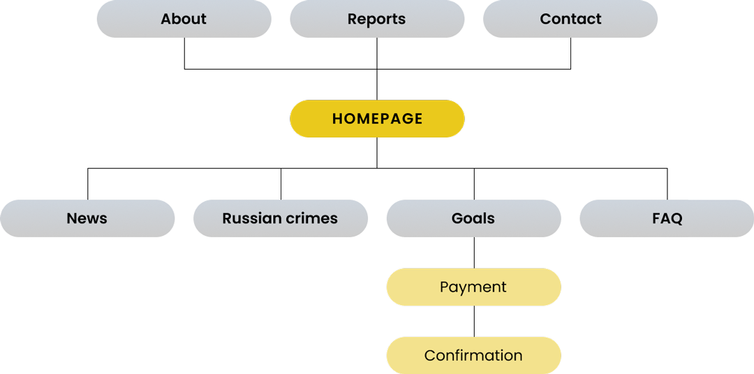
With the app designs completed, I started work on designing the responsive website. I used the following sitemap to guide the organizational structure of each screen's design to ensure a cohesive and consistent experience across devices.
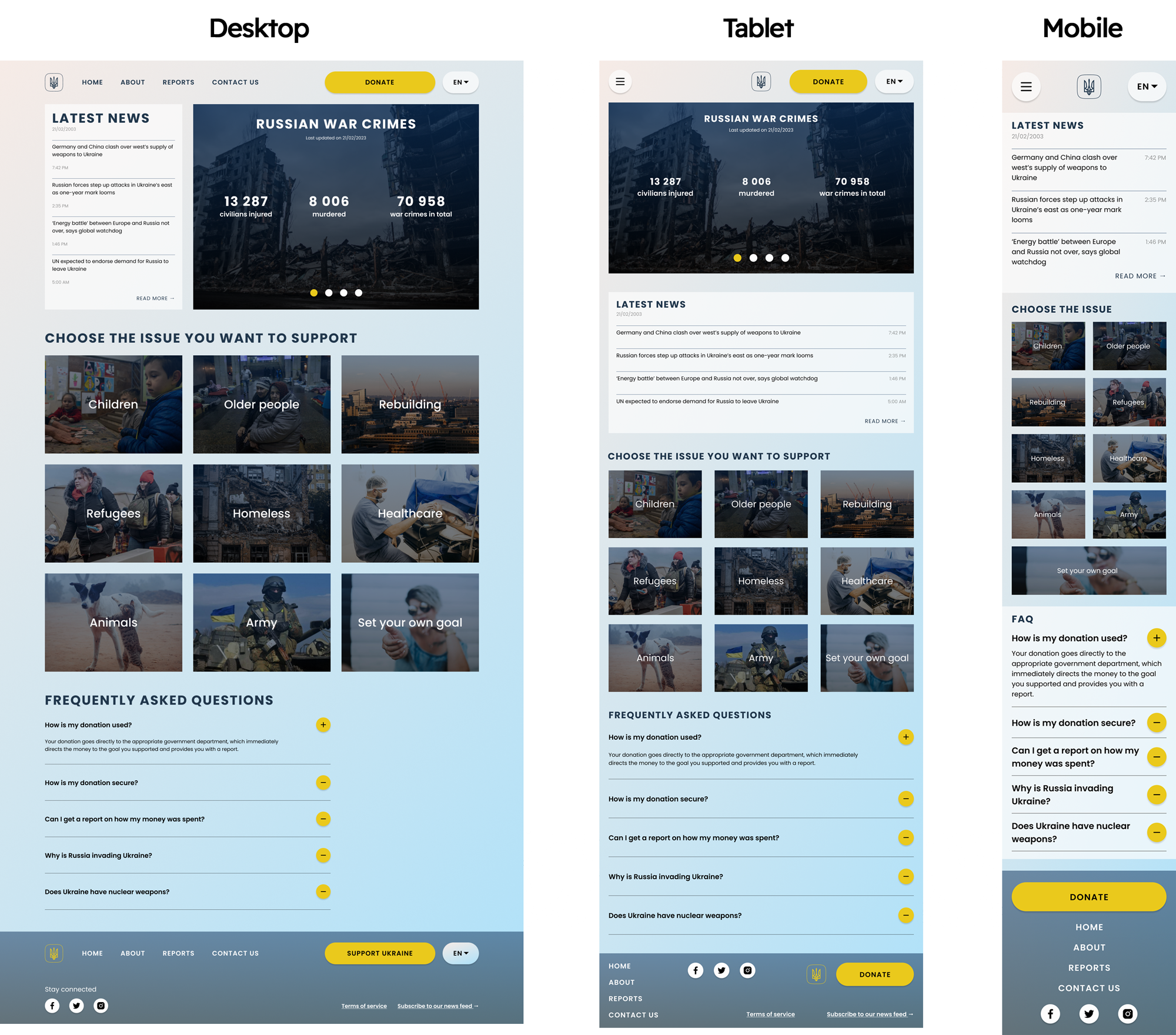
The designs for screen size variation included mobile, tablet, and desktop. I optimized the designs to fit specific user needs of each device and screen size.
The project is focused on increasing the awareness of people in the world about the brutality and war crimes of the Russian terrorist regime. It seeks to attract caring people abroad to help Ukraine and its inhabitants to survive and eventually win. I learned that even though the problem I was trying to solve was a big one, diligently going through each step of the design process and aligning with specific user needs helped me come up with solutions that were both feasible and useful.
Go to case study deck