Pumpa is a multifunctional recipe organizer that aims to simplify the process of collecting recipes and creating menus for both food service establishments (such as family diners) and chefs, as well as for amateurs who are fond of cooking. In addition, the app helps you create shopping lists, compare product prices from your favorite vendors, and even send your shopping lists to them.
1 Develop a clear and consistent interface for users with any level of technology proficiency.
2 Focus on the main functionality of the app without distracting users with unnecessary details.
3 Provide the app accessibility, taking into account users' special needs.
I conducted user research and created empathy maps to understand the users I’m designing for and their needs. A primary user groups identified through research were: 1) small and medium restaurant business owners 2) home cooking enthusiasts. Both groups need an efficient way to manage recipes, considering the price of ingredients/serving, since both of them are willing to save time and money.
Working adults and business owners are too busy to compare ingredient prices and cost per serving.
Recipe organizers don't support all languages, can’t recognize handwritten text or have options, available in limited regions.
Navigation in most apps is too complicated and not very intuitive.
Multiple choices make it difficult for users to make a decision.

Name: Daniel
Age: 49
Occupation: Grill restaurant owner
Daniel runs a small but popular grill restaurant is his hometown. He is not used to delegating and prefers to control all processes himself. He is sometimes frustrated with his chef's menu choices and purchasing costs and wants to rationalize it. He dreams of spending more time with his family.
Name: Jenny
Age: 27
Occupation: School teacher
Jenny is an aspiring geography teacher. She is a food enthusiast. She loves to try new recipes and surprise her friends with an unusual combination of ingredients. She lives with her dog and is in no hurry to start a family, as she is an avid traveler and dreams of visiting all the countries of the world first.
I analyzed the available options and user experience of several similar applications: 3 direct and 1 indirect potential competitors. The main goal was to compare their strengths and weaknesses.
View the detailed audit comparison table ➜1 Make the app available in most popular languages, make it's design more intuitive and less dependant on text/language.
2 Implement hand-written text recognition option with the support of all popular languages.
3 Provide basic features without registration required; simplify the registration process; provide various sign up alternatives.
4 Make the tone of the content more friendly and personalized avoiding clerical words.
View the competitive audit report ➜At the initial design phase I tried to base screen designs on findings from the user research. My goal was to consider accessibility and provide alternative ways of navigation, to ease user experience.
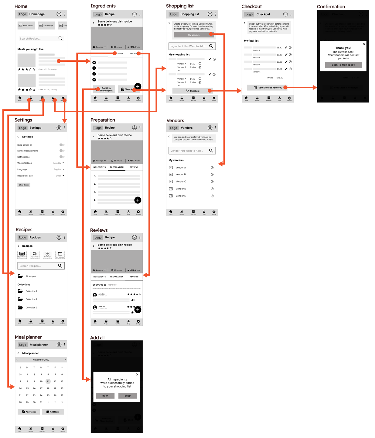
The low-fidelity prototype connected the primary user flow of choosing a recipe, adding its ingredients to the shopping list, and placing the order, so that the prototype could be used in a usability study with users.
View the low-fidelity prototype ➜After creating the lo-fi prototype I conducted the first round of usability study to figure out if users can complete the core tasks within the app.
View the study plan ➜Five participants (2 male, 3 female, aged 20-60, 2 users of assistive technologies) went through an online moderated study. They were asked to perform several activities of browsing dish recipes, evaluating the cost per serving and the availability of ingredients, adding the ingredients to the shopping list, choosing vendors, and placing an order.
View the UX study note-taking spreadsheet ➜I grouped my observations and users' comments into themes and created an affinity diagram. The research revealed several themes of common user problems.
1 Users need a more intuitive way to add and select vendors.
2 Users want cues that explain what happens when they tap the buttons.
3 Users prefer to have a search and recommendation options on most pages.
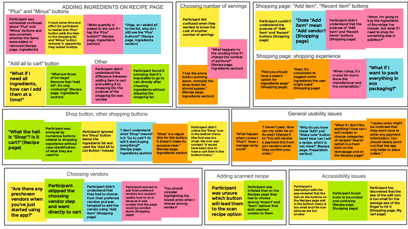
View the research presentation ➜Before creating mockups I had to determine the brand name and color schemes. Considering the purpose of the application and the specifics of the market, I chose the brand name through brainstorming, then I developed a logotype and selected primary and secondary color palettes.
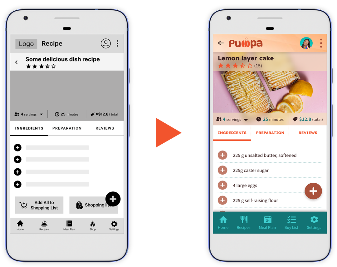
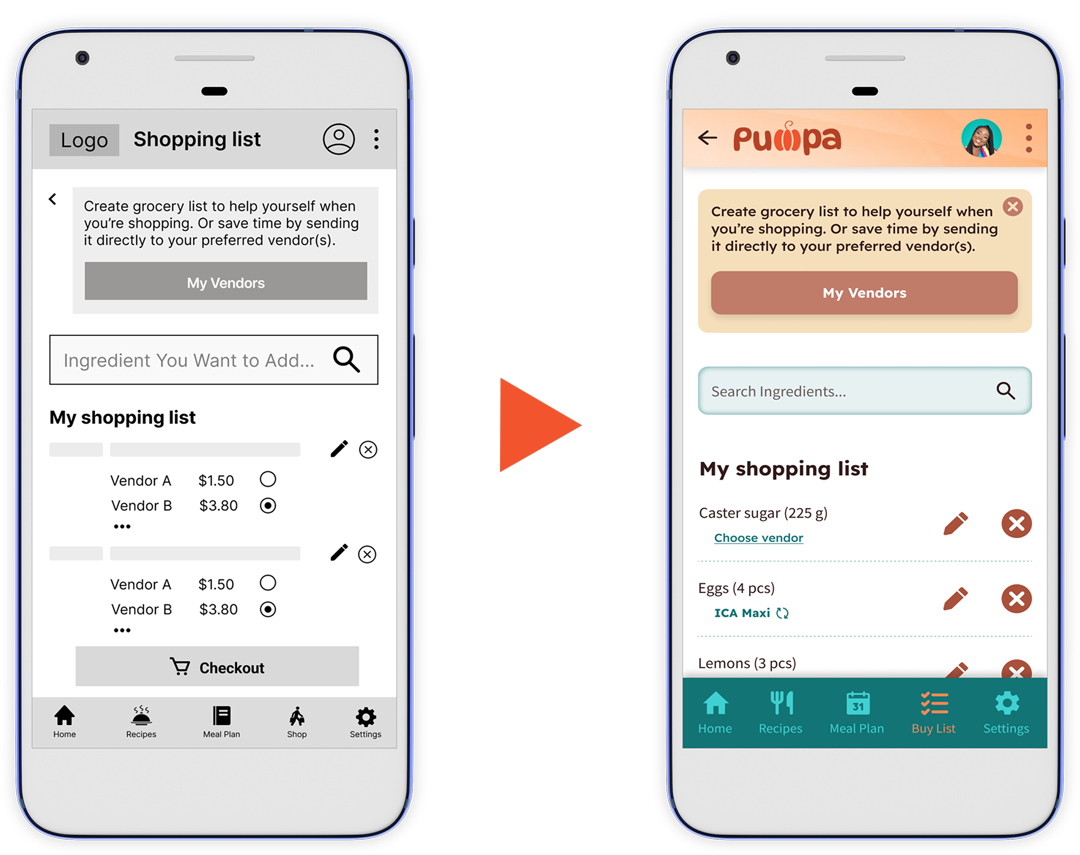
Considering key UX study findings and brand color palette, I designed mockups and created a high-fidelity prototype of the recipe organizer app.
View the high-fidelity prototype ➜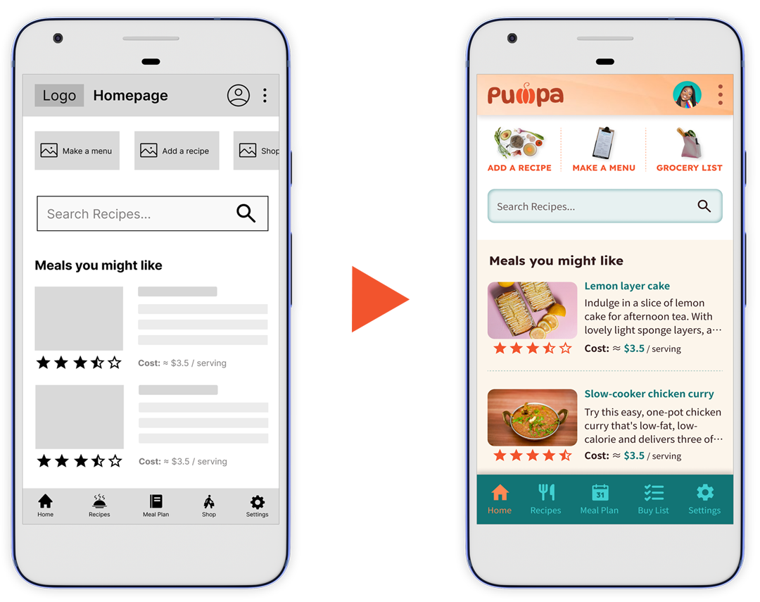
To take into account the needs of people using various devices, a design of a website with similar functionality was created.
View the high-fidelity prototype ➜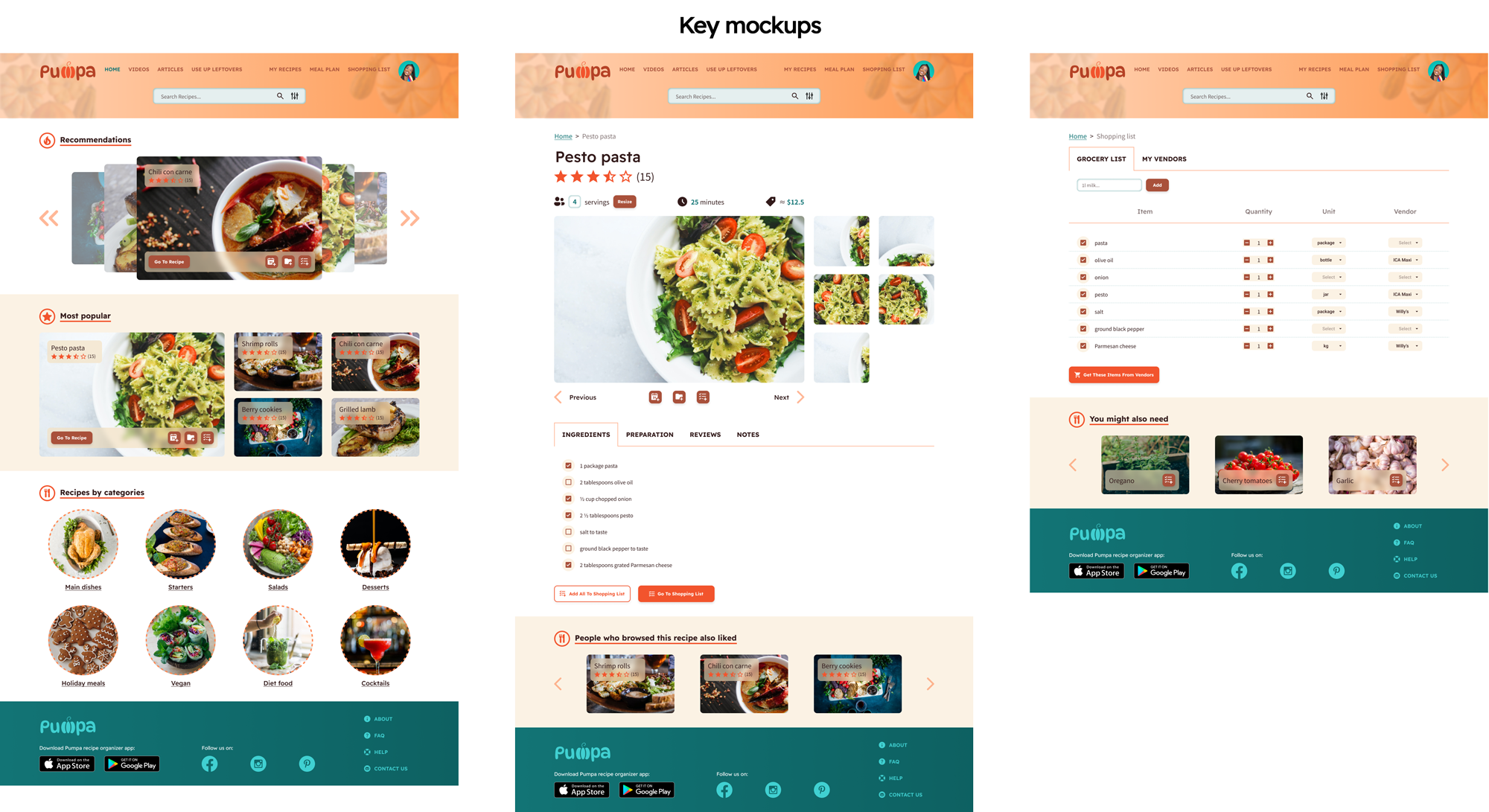
The app facilitates the management of recipes, collections and menus for people who like cooking. It saves time for working individuals and businessmen. Puma recipe organizer takes into account the shortcomings of its competitors and strives to meet the needs of people with different abilities who speak different languages. While designing, I learned that the UX designer should be prepared to iterate on their designs many times to achieve positive user experience and better accessibility.
Go to case study deck